The EASIEST way to inject Pantone’s colour of the year into your home!
Simple styling tips ANY ONE can apply!
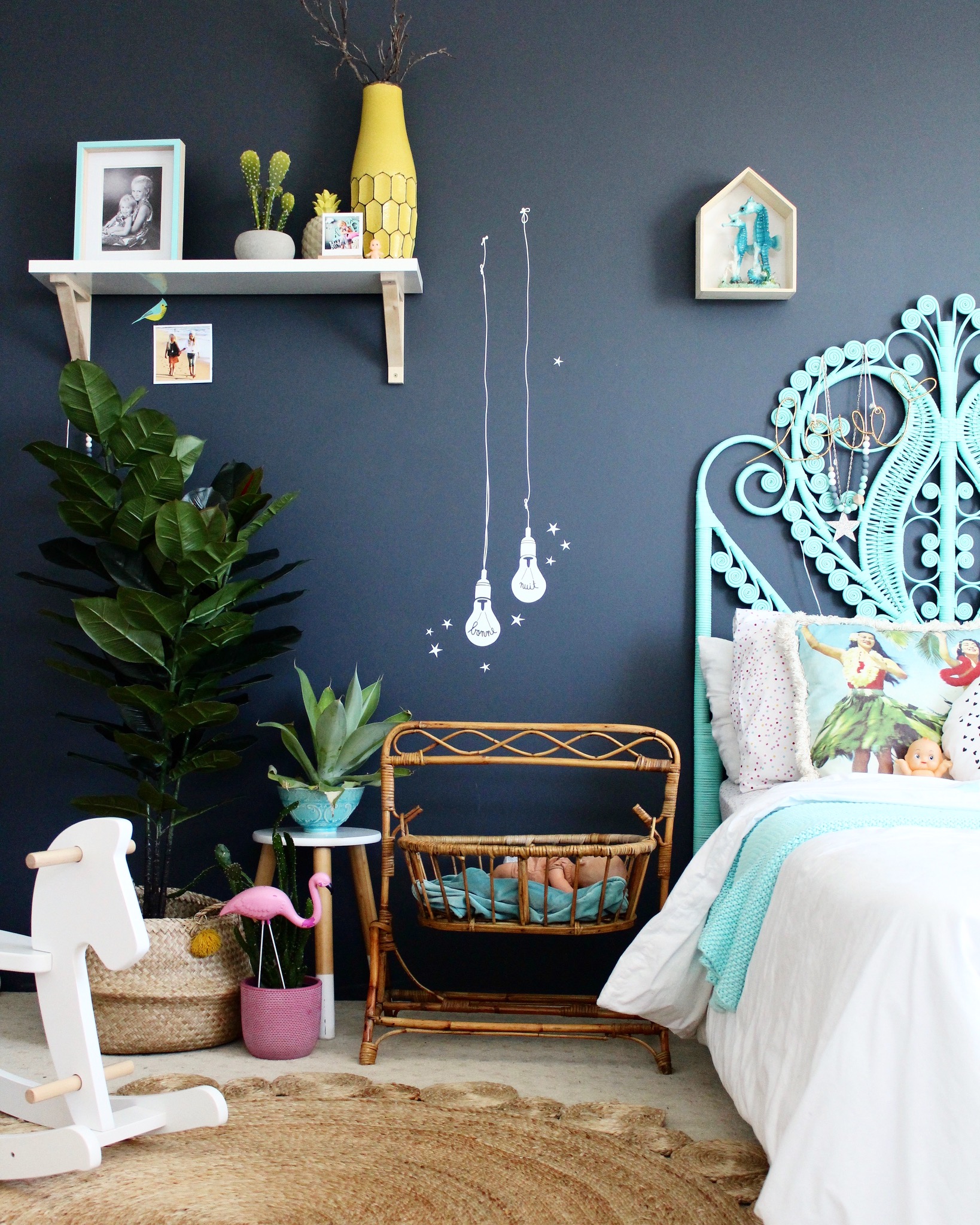
The 2017 Pantone colour of the year would have to be one of my all time favourites, not only for the natural hues it injects into the home, but for the versatility and ease of this user friendly colour. It’s fresh, simplistic, invigorating and allows us to reconnect to that all important element, that somehow soothes us all so well.
The one and only – nature.
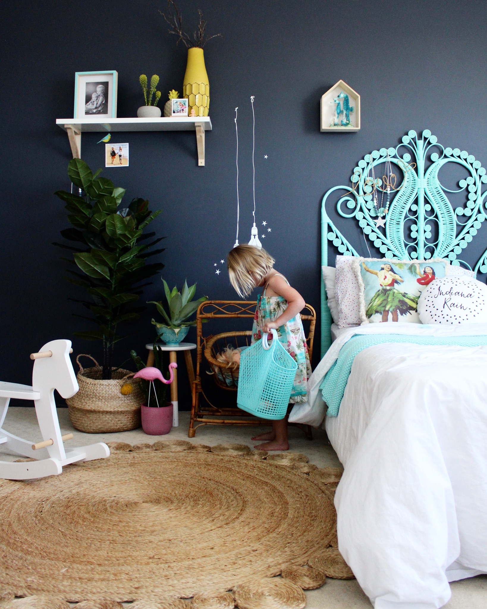
So, what exactly is Pantone’s colour of the year Greenery all about?
As stated on Pantone’s site, Greenery is,
“A refreshing and revitalizing shade, Greenery is symbolic of new beginnings.
Greenery is a fresh and zesty yellow-green shade that evokes the first days of spring when nature’s greens revive, restore and renew. Illustrative of flourishing foliage and the lushness of the great outdoors, the fortifying attributes of Greenery signals consumers to take a deep breath, oxygenate and reinvigorate.
Greenery is nature’s neutral. The more submerged people are in modern life, the greater their innate craving to immerse themselves in the physical beauty and inherent unity of the natural world. This shift is reflected by the proliferation of all things expressive of Greenery in daily lives through urban planning, architecture, lifestyle and design choices globally. A constant on the periphery, Greenery is now being pulled to the forefront – it is an omnipresent hue around the world.
A life-affirming shade, Greenery is also emblematic of the pursuit of personal passions and vitality”. (Quote directly from Pantone)
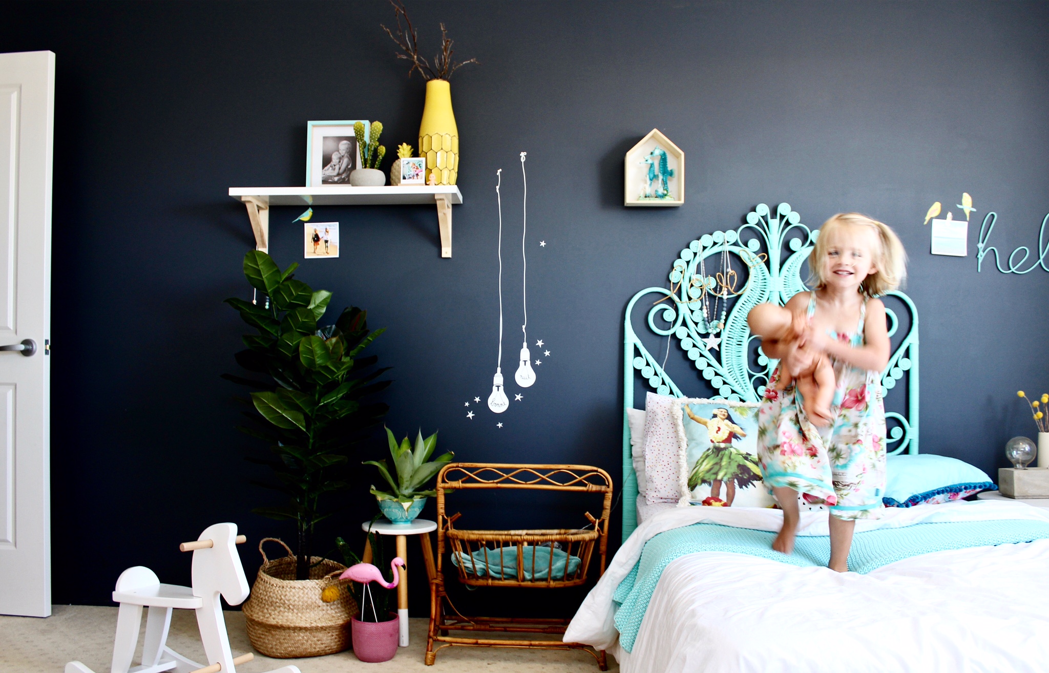
And what is THE EASIEST way to add a little colour of the year splash into your interiors – by going back to basics and looking to nature, with, you guessed it PLANTS!
Easiest styling tip EVER!
And the best part is, this method of injecting Pantone’s 2017 colour of the year lends itself beautifully into ANY interior space. I mean, what space doesn’t look better with a little plant life!
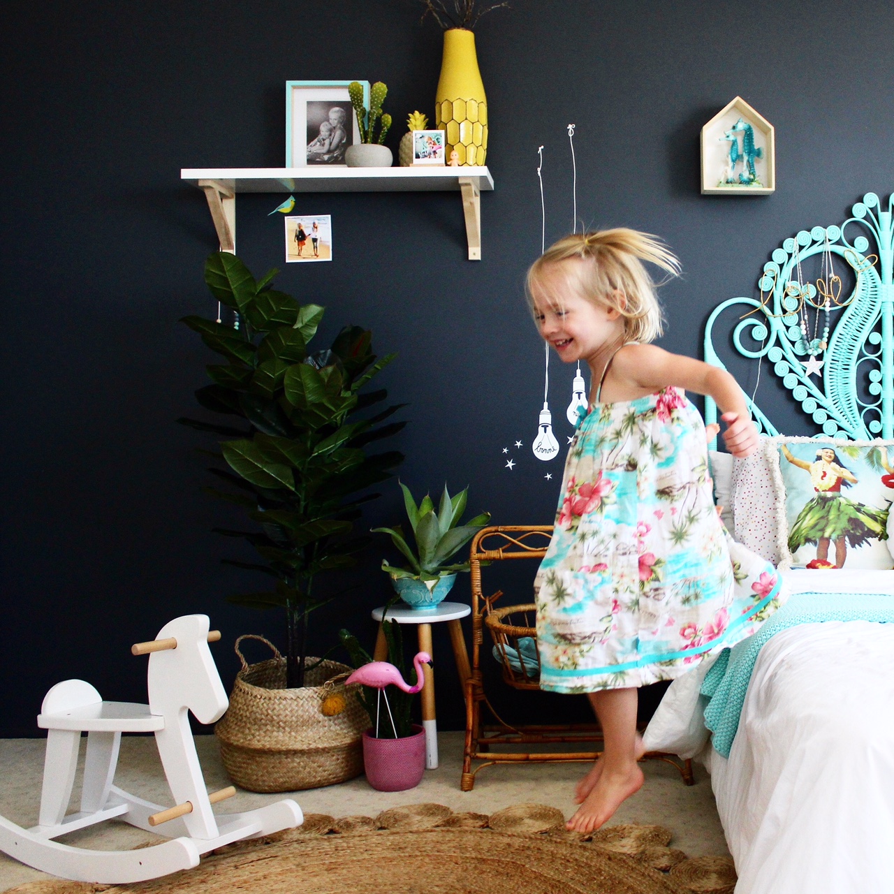
ABOVE: Pantone’s colour of the year has me jumping for joy!
STYLING TIP: Cluster plants in threes or more to create visual impact in a space. To add ‘height’ you can use plant stands, or be resourceful and use what you have, like a small stool as pictured above.
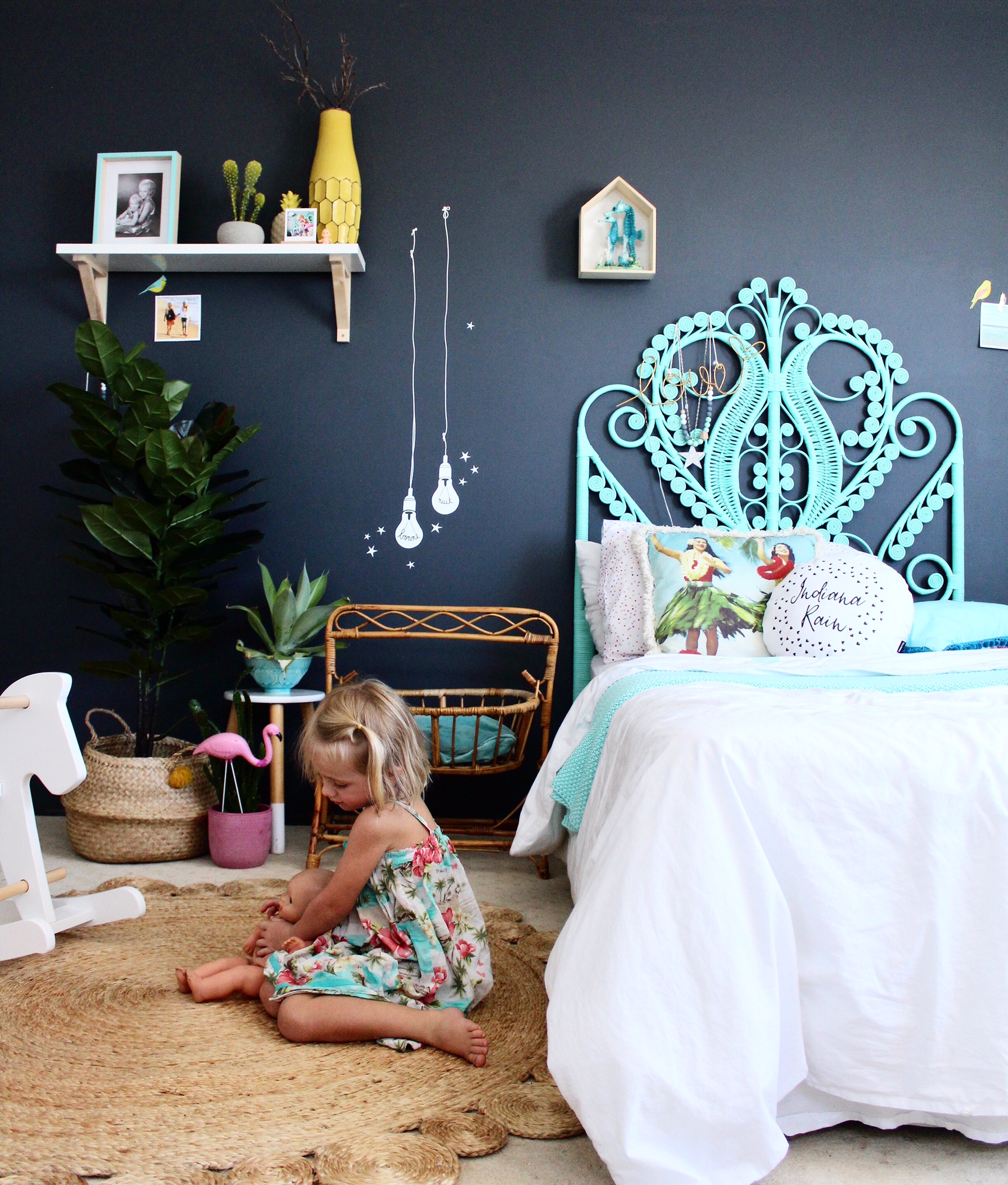
ABOVE: On the bed, a simple throw pillow with a dash of greenery in the print helps tie to colour scheme together in a very simplistic way.
If plants are not your thing, or you want to go that little bit further – a tropical print (think palms or cactus) in either bedding or wall art is a subtle way to inject some Pantone magic of Greenery into your home.
And if you want to save costs, or get creative, try going for a nature walk, look above and take a few snaps of your own of natures finest, then print and display!
Back soon, time to get gardening and bring a little more of the outdoors in.
Thanks for stopping by, love Ness X
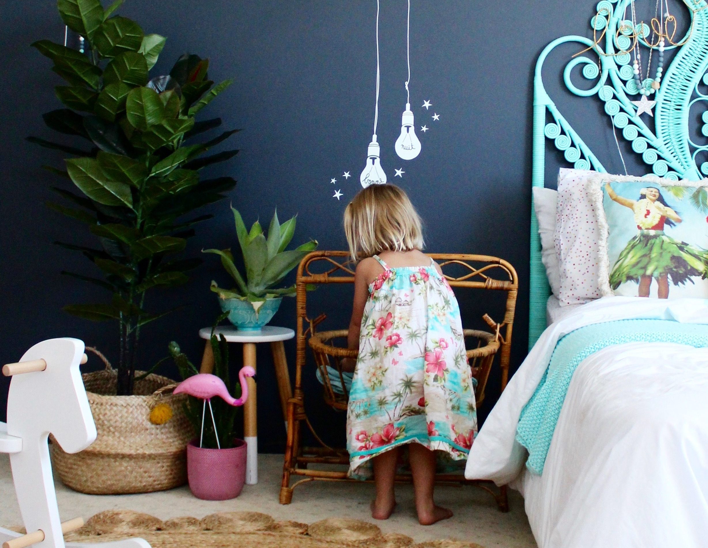




Is the lightbulb in the blue wall a sticker or did you pain it using a stencil? If it was a stencil can you tell me which brand? Awesome looks, love your decorating style!
Hi, the lightbulb is a mimi’LOU wall sticker. Its glows in the dark which is really cute. The Australian wholesale supplier stockist is called ‘can’t find it’ if you need a starting point. Thanks for asking X